| Res.Df | RSS | Df | Sum of Sq | F | Pr(>F) |
|---|---|---|---|---|---|
| 342 | 143881.3 | NA | NA | NA | NA |
| 337 | 143017.6 | 5 | 863.651 | 0.407 | 0.844 |
Introduction
We are considering a dataset that provides some demographic information for 440 of the most populous counties in the United States in years 1990-92. Each line of the dataset provides information on 14 variables for a single county. Counties with missing data were deleted from the dataset. We are building models to predict the number of crimes per 1000 people in each county. We first explore linear regression models and then a negative binomial regression model. We found that the best linear regression model performed similarly to the negative binomial regression model on the training and test set using the same variables.
Goals
The goals of the analysis was the find a model that is simple yet explains as much as possible. The model should make sense first and foremost. Automatic methods such as the backwards step algorithm were used as auxiliary methods to supplement a more hand selected model. We decided against using all possible subsets selection as a matter of principle as it can lead to models that lack explainability. We explore interactions between variables as well as standard additive models. Once model selection is done based on the training set the final results are reported against the test set (20% of the dataset). The test set was not looked at or used in the model building process. The models were compared on the training set using 10-fold cross validation and leave one out cross validation (LOOCV).
Data Processing
Some additional variables were created. The variables “beds”, “phys”, and “area” were all divided by the population to give a per capita total number of hospital beds, cribs and bassinets, per capita number of physicians practicing, and the per capita area. We then remove the total quantities from the data set. We found that working with per capita was more informative than the direct quantities. The data was also transformed almost entirely with natural log transform as it performed better for our model. We arrived at natural log based on the plots, residuals plots, and looking how the model’s \(R^2\) changed with regard to the transformations along with cross validation. The data summary can be found in the appendix.
Models
Full Model
crm1000 ~ percapitaarea + popul + pop1834 + pop65plus +
          percapitaphys + percapitabeds + higrads + bachelors +
          poors + unemployed + percapitaincome + region
The full model was used as a baseline model, and subsequent models were reduced from this model.
Base Model
crm1000 ~ percapitaarea + popul + pop1834 +
          percapitabeds + poors + percapitaincome + region
These are the variables from which all the other models are based. We arrived at this model by keeping one variable from each correlation cluster that seemed to make the most intuitive sense to keep. We confirmed that this was a good model by starting with all of the variables and using backward selection to arrive at the identicial model that we had selected by hand. Then a partial F-test was performed, see table below. The F statistic was extremely small, which means that the residual sum of squares was almost the same after dropping the variables pop65plus, percapitaphys, higrads, bachelors, and unemployed. From this reduced model, we built up variations that involved transformations and interactions.
(Final Model) Log Transformed model with no interactions
This model ended up being our final model selection. The transformation were found through cross validation and analysis of the plots of the data.
crm1000 ~ log(percapitaarea) + log(popul) + log(pop1834) +
          log(percapitabeds) + log(poors) + log(percapitaincome) + region
Transformations and Interactions with only region.
We included all interactions between the continuous variables and the region. We then backward selected that reduced to (log) population and (log) per capita income against the region. While running the backwards selection we checked that the main effects were not dropped while the interactions were kept.
crm1000 ~ log(percapitaarea) + log(popul) + log(pop1834) +
          log(percapitabeds) + log(poors) + log(percapitaincome) +
          region + log(popul):region + log(percapitaincome):region
Transformations and Interactions against all variables.
We included the interactions between all variables (including continuous-continuous) then backward selected. Both of the interactions models included log(popul):region but the larger interaction model did not include log(percapitaincome):region. We suspect this may be from the correlation between per capita income and some of the other variables that are included such as the percentage of poor people.
crm1000 ~ log(percapitaarea) + log(popul) + log(pop1834) +
          log(percapitabeds) + log(poors) + log(percapitaincome) +
          region + log(popul):log(percapitabeds) +
          log(popul):log(poors) + log(popul):log(percapitaincome) +
          log(popul):region + log(pop1834):region +
          log(percapitabeds):region + log(poors):log(percapitaincome) +
          log(poors):region
Negative Binomial Generalized Linear Model
We used the same variables from the log transformed model with no interactions. Instead of modeling crime rate per 1000 people directly we model the crimes. We use an offset to adjust the parameters according to the population (more is described in Negative Binomial Model section).
crimes ~ offset(log(popul / 1000)) + log(percapitaarea) +
         log(popul) + log(pop1834) + log(percapitabeds) +
         log(poors) + log(percapitaincome) + region
Other models
For our cross-validation and model selection we included two models which we did not intend to use but only for comparision purposes. They were the full model which was described above. Also, we included a model which we call the simple model which only included the natural log of the percentage of poor people in the county.
Multicollinearity
In this dataset there are many variables that are highly correlated (see appendix for correlation plot). We found that the percentage of poor people in a county was highly correlated with the per capita income and the number of high school grads. If we include all of the variables with high multicollinearity the standard errors will be increased and some of the variables may not end up being significant. We used the Variance inflation factor (VIF) to measure the multicollinearity in our model. The VIF gives us a measure of how much the coefficient’s variance will increase due to collinearity between the other variables [2]. The VIF factors are the computed by regressing all the other explanatory variables on a single variable \(x_i\). For each variable \(i\), we calculate the VIF by performing \(i\) regressions using all other variables to predict \(x_i\). \[ x_i = \beta_0 + \beta_1 x_1 + \cdots + \beta_{i - 1} x_{i - 1} + \beta_{i + 1} x_{i + 1} + \cdots \beta_{p-1} x_{p-1} \] Then the VIF factor is equal to \[ VIF_i = \frac{1}{1 - R_i^2} \] Where \(R_i^2\) is the \(R^2\) when using all other variables in a regression on variable \(i\). [4] We removed the variables for per capita income, the number of high school graduates, and the number of bachelor degree graduates based on the VIF results. The last column in the table shows how much the standard error of the variable is increased due to the collinearity. For example, for the bachelors variable the value of 2.834 means that the standard error for \(\beta_{bachelors}\) is 2.834 larger than if the variables were not correlated with each other.
| VIF | DF | VIF^(1/(2*Df)) | |
|---|---|---|---|
| bachelors | 7.716 | 1 | 2.778 |
| percapitaincome | 5.490 | 1 | 2.343 |
| higrads | 5.022 | 1 | 2.241 |
| poors | 4.461 | 1 | 2.112 |
| percapitabeds | 3.582 | 1 | 1.893 |
| percapitaphys | 3.435 | 1 | 1.853 |
| region | 2.716 | 3 | 1.181 |
| pop1834 | 2.320 | 1 | 1.523 |
| unemployed | 2.304 | 1 | 1.518 |
| pop65plus | 2.146 | 1 | 1.465 |
| percapitaarea | 1.563 | 1 | 1.250 |
| popul | 1.245 | 1 | 1.116 |
Outliers
When looking at the training data we noticed one outlier with respect to the target variable in the training dataset (Kings County in New York). It has a crime rate of approximately 296 per 1000 people. The median for the training set was a crime rate of 53.55 per 1000 people. In the training set we found that Kings County has larger leverage and also has high influence. There are also outliers with respect to the other variables but the amount is reduced when we took the log transform of the data. In the appendix, we go into more detailed look at other outliers based on the studentized residuals and influence.
Interactions
We explored and built models that included interactions between the variables. We found that while some of the interactions were significant, when doing cross validation the additive model without any interactions performed the best. Using the partial F-test, we compared the two interaction models with the additive model. For the interactions model with only region, we did not reject the null hypothesis at the \(\alpha = 0.05\) level, as the p-value was 0.06. The value was close enough that we decided to continue to compare with this model as well. The results can be see in the table below. When we run a partial F-test on the interaction models with more interactions, we get a larger test statistic that allows us to reject the null hypothesis at the \(\alpha = 0.05\) level.
| Res.Df | RSS | Df | Sum of Sq | F | Pr(>F) |
|---|---|---|---|---|---|
| 342 | 121929.0 | NA | NA | NA | NA |
| 336 | 117312.6 | 6 | 4616.4 | 2.204 | 0.042 |
| Res.Df | RSS | Df | Sum of Sq | F | Pr(>F) |
|---|---|---|---|---|---|
| 342 | 121929.0 | NA | NA | NA | NA |
| 326 | 106585.4 | 16 | 15343.55 | 2.933093 | 0.00015 |
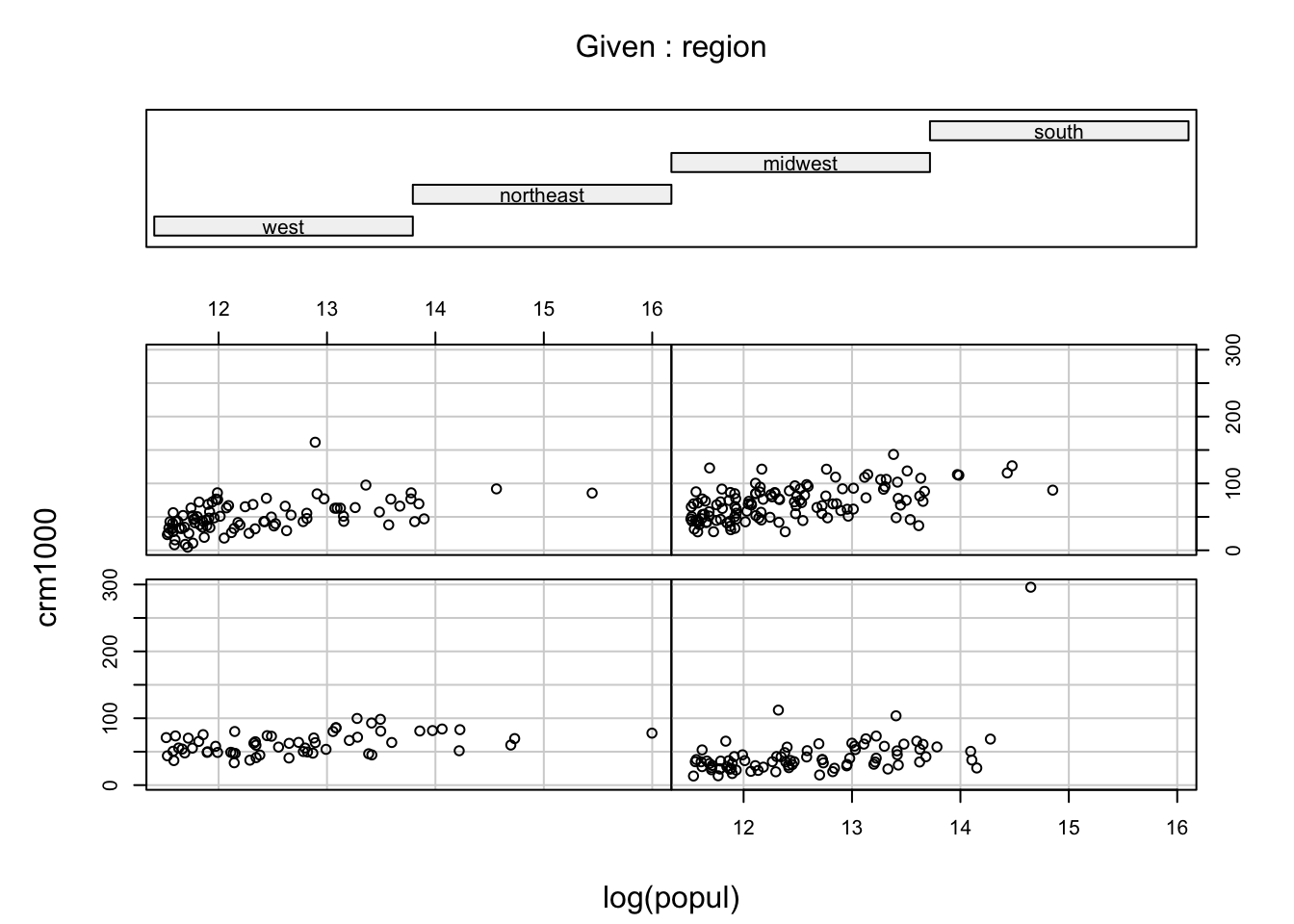
In the conditional plot we can see the values of the log of population vs the crime rate for each of the regions. The bottom left panel is the West, bottom right is the northeast, top left is the midwest and top right is the south. There seems to be a slightly smaller slope in the West panel, but overall it is not clear that the interactions are needed.
Our original cross validation was performed on data that was not centered (mean subtracted off). Centering can improve the standard errors and thus the p-values of the estimates but the predictions for the new values are the same. Since our final model does not include the interactions, we decided against centering the data. When building the interaction models we included all of the interactions (for region and then for all variables) and then backward selected. We did this twice: once with the data centered and once without the data being centered. While this does not make a difference for the estimate, the standard errors decrease in the centered model. That made the backwards selection algorithm stop earlier when we centered the data, and thus included more of the interaction variables. Again, at this point we checked to make sure that no interaction effects were included when a main effect was dropped. When including these centered models in our cross validation we found that they performed worse than the backward selection models on the original (non-standardized) data so we chose not to include them in our analysis.
Model Interpretation
On the training data, we had an \(R^2\) of 0.56 which means that 54.3% of the error is explained by our model. The \(R_{adj}^2\) was 0.548.
| Estimate | Std. Error | Pr(>|t|) | |
|---|---|---|---|
| (Intercept) | -360.441 | 105.325 | 0.001 |
| log(percapitaarea) | -5.346 | 1.462 | 0.000 |
| log(popul) | 6.490 | 1.944 | 0.001 |
| log(pop1834) | 19.330 | 7.858 | 0.014 |
| log(percapitabeds) | 4.351 | 2.495 | 0.082 |
| log(poors) | 25.918 | 3.844 | 0.000 |
| log(percapitaincome) | 22.224 | 9.501 | 0.020 |
| regionnortheast | -17.144 | 3.863 | 0.000 |
| regionmidwest | -9.936 | 3.791 | 0.009 |
| regionsouth | 4.436 | 3.425 | 0.196 |
Let’s look at what these estimates actually mean. Since we are working on a log scale we can interpret the estimate \(\beta_{area}\) for log(percapitaarea) as the change in crime rate per 1000, \(crm_{1000}\), when \(log(percapitaarea)\) increases by 1. That is, \(\ln x_{area} + 1 = \ln(e \cdot x_{area})\). So if \(x_{area}\) is multiplied by \(e \approx 2.718\), then \(crm_{1000}\) increases by \(\beta_{area}\). It can be easier to interpret if we look at percentage increase instead of multiplying by \(e\). If the per captia area increases by 10%, then the crime rate per 1000 people will decrease by 0.49. \(\beta_{area} \cdot ln(1.10) = -5.127 \cdot ln(1.10) = -0.49\). This is summarized in the table
| 5% | 10% | 20% | 30% | |
|---|---|---|---|---|
| percapitaarea | -0.261 | -0.510 | -0.975 | -1.403 |
| popul | 0.317 | 0.619 | 1.183 | 1.703 |
| pop1834 | 0.943 | 1.842 | 3.524 | 5.072 |
| percapitabeds | 0.212 | 0.415 | 0.793 | 1.142 |
| poors | 1.265 | 2.470 | 4.725 | 6.800 |
| percapitaincome | 1.084 | 2.118 | 4.052 | 5.831 |
From this table we can see that if the the percentage of poor people increased from 20 to 22, we would expect to see an increase of 2.428 in the number of crimes per 1000 people. We can also see that if the per captia area increases from \(5 \times 10^{-3}\) to \(5.5 \times 10^{-3}\) we would expect the number of crimes per 1000 people to drop by 0.489.
Region
We used “West” as our reference category so all the parameter estimates are in relation to the west region. We can interpret the estimate \(\beta_{region_{NE}} = -18.548\) as the estimate change in crimes per 1000 people between the west and the north east. That is, holding all else constant, the north-east region is estimated to have \(18.548\) less crimes per 1000 people. Both the north-east and the midwest are statistically significant at the \(\alpha = 0.05\) level. The difference between the south and the west’s rate of crimes is not statistically significant. That means that the there is not enough evidence from the data to show there is a difference in crime rates between the south and the west (assuming all else is held constant).
Negative Binomial Model
We also explored generalized linear models for predicting the crime rate. Since we are dealing with the rate \(1000 * crimes/popul\), we can formulate our model as
\[ log(crimes) = log(popul/1000) + X\beta \]
Since we are using the (log) population in our model, having an offset is equivalent to the value of the coefficient for log(population) will increased by 1, and the intercept decreased by log(1000). We first tested a Poisson regression which assumed that the variance and expected value are the same for the crimes. When performing a dispersion test at \(\alpha = 0.05\), we rejected the null that dispersion is equal to one. (Estimated dispersion was 2622.163). When dispersion is greater than one, we say that the data is overdispersed. The negative binomial model works better in the presence of overdispersion.
Interpreting Results
| Estimate | p-value | |
|---|---|---|
| (Intercept) | -3.262 | 0.057 |
| log(percapitaarea) | -0.065 | 0.006 |
| log(popul) | 0.116 | 0.000 |
| log(pop1834) | 0.330 | 0.010 |
| log(percapitabeds) | 0.105 | 0.010 |
| log(poors) | 0.417 | 0.000 |
| log(percapitaincome) | 0.428 | 0.006 |
| regionnortheast | -0.404 | 0.000 |
| regionmidwest | -0.219 | 0.000 |
| regionsouth | 0.045 | 0.416 |
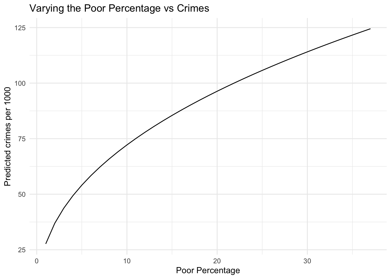
We can interpret the results from negative binomial similarly to Poisson regression [1] [3]. Let’s look at how the percentage of poor people in a county influences the number of crimes. We have that \[ \log(crimes) = \beta_0 + \beta_{poors} \log x_{poors} + \cdots \] or \[ crimes = \exp(\beta_0 + \beta_{poors} \log x_{poors} + \cdots) = e^{\beta_0} x_{poors}^{\beta_{poors}} \cdots \] Now if we want to see what happens as \(x_{poors}\) changes, say to \(x_{poors}^{\prime}\), then we have that \[ \frac{crimes^{\prime}}{crimes} = \left(\frac{x_{poors}^{\prime}}{x_{poors}}\right)^{\beta_{poors}} \] That is, the percentage change in the crimes is equal to the percentage change in percentage of poor people to the power of the coefficient for poors. Equivalently we pose this additively as \[ \log crimes^{\prime} - \log crimes = \beta_{poors} \left( \log x_{poors}^{\prime} - \log x_{poors} \right) \] So if we kept all other variables constant, and increased \(x_{poors}\) from 10 to 12 we would expect: \[ \frac{crimes^{\prime}}{crimes} = \left(\frac{12}{10} \right)^{0.414} = 1.078 \] That is, we would expect the crimes to increase by 7.8%. We can confirm this for the predicted crimes per 1000 people while holding all other variables at the means. When \(x_{poors} = 10\), then the predicted crime rate is 72.18. The predicted crime from for \(x_{poors} = 12\) is 77.88. The ratio of these values is 1.079 which is what we found from the coefficient interpretation.
It is also useful to look at how the predicts change as one of the variables varies. We set all of the variables involved in the regression to the means and then only varied the percentage of poor from 1 to 37, which is approximately the range found in the training set. It is easier to see how the crime rate changes from this graph due to the poor percentage changing than just the estimated coefficients.
Cross Validation
Once we had built our models we used 10-fold cross validation to compare them against each other. We also used LOOCV which resulted in very similar results to the 10-fold cross validation. Once we had included the negative binomial model we switched to only using the 10-fold cross validation. The interactions models had a better adjusted \(R^2\) value and were found with the partial F-test to have at least one parameters that should not be set to 0 (at alpha = 0.05 significance level). We included a model called “Full”, which had all of the dependent variables included (without transformation) and a “simple” model which is only using the natural log of the percentage of poor people for each county.
| Additive | NB | RegionInter | AllInter | Full | Simple |
|---|---|---|---|---|---|
| 376.1 | 391.38 | 409.8 | 421.52 | 489.51 | 606.04 |
Test Validation
At this point of the analysis everything had been conducted on the training 80% of the dataset. Cross validation was used as part of the model building process which means that the results will be biased. We kept the test set held out until the end when all models were finalized so that the estimated mean squared error is a better indication of the true mean squared error. The results on the test sets are as follows
| AllInter | NB | Additive | RegionInter | Full | Simple |
|---|---|---|---|---|---|
| 245.68 | 251.68 | 262.09 | 276.91 | 300.24 | 459.16 |
| AllInter | Additive | NB | RegionInter | Full | Simple |
|---|---|---|---|---|---|
| 231.13 | 246.12 | 248.63 | 252.25 | 296.38 | 452.95 |
We can see that including Kings County (NY) leads to slightly better results in the test set. Based on these results, we can see that both the negative binomial and the additive model without interactions performs the best and almost identically. Since linear regression is faster and simpler to interpret the results our final model is the Log Transformed model with no interactions, in the models section.
Using this as our final model, we can fit this model to the test selection data. This can be seen as a more conservative approach to our parameters since it is on the test set rather than the training.
| Estimate | Std. Error | Pr(>|t|) | |
|---|---|---|---|
| (Intercept) | -616.416 | 199.524 | 0.003 |
| log(percapitaarea) | -1.448 | 2.794 | 0.606 |
| log(popul) | 4.967 | 3.525 | 0.163 |
| log(pop1834) | 19.648 | 11.078 | 0.080 |
| log(percapitabeds) | 3.228 | 4.428 | 0.468 |
| log(poors) | 25.484 | 6.820 | 0.000 |
| log(percapitaincome) | 51.636 | 18.351 | 0.006 |
| regionnortheast | -23.065 | 6.468 | 0.001 |
| regionmidwest | -5.330 | 7.119 | 0.456 |
| regionsouth | 8.088 | 6.582 | 0.223 |
We have \(R^2_{adj} =\) 0.552 and \(R^2 =\) 0.598. Which means that 59.8 percent of the error is explained by our model. The p-values in this table are the most conservative, since we have not seen any of the data when testing this hypothesis. In this way, it is like a properly run experiment. We do not want to fish for statistically significance by creating hypotheses based on our data set. Instead if we formulate our hypothesis beforehand we should use the data set to validate our hypothesis.
Final Coefficients
Combining the training and test data sets and fitting our final model on this gives us our final coefficients. We want to use all the data if we are going to predict for more counties in the future. We can interpret these estimates exactly the same as for the training and test data. The p-values are artificially low, due to a large sample size and the fact that 80% of the data is from the training set which we used to generated the hypothesis.
| Estimate | Std. Error | Pr(>|t|) | |
|---|---|---|---|
| (Intercept) | -387.885 | 92.606 | 0.000 |
| log(percapitaarea) | -5.009 | 1.276 | 0.000 |
| log(popul) | 6.108 | 1.697 | 0.000 |
| log(pop1834) | 18.891 | 6.415 | 0.003 |
| log(percapitabeds) | 4.327 | 2.163 | 0.046 |
| log(poors) | 25.606 | 3.345 | 0.000 |
| log(percapitaincome) | 25.910 | 8.400 | 0.002 |
| regionnortheast | -18.795 | 3.311 | 0.000 |
| regionmidwest | -9.823 | 3.303 | 0.003 |
| regionsouth | 4.531 | 3.009 | 0.133 |
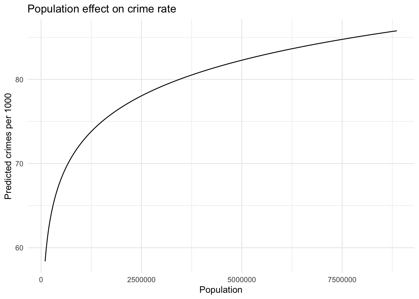
We find it easier to understand some of these estimates with plots. Below we show how the predicted crime rates change when holding all variables constant (keeping the other variables at the mean) while varying only the population. We range the population from the minimum 100043 to the maximum 8863164.
Conclusion
In this analysis we investigated the crime rates for 440 counties in the United States. The dataset was split into 80% training data and 20% test data. The test dataset was untouched until all models were finalized. We compared multiple linear regression models and a negative binomial model and compared the results. The models were compared using 10-fold cross validation as part of the model building process as well as for validation. The most predictive variables in the data set were the population, the percentage of the population between 18 and 34, the per captia beds, the percentage of poor people, the per capita income, and the region in the United States. We showed that the difference between West and Northeast crime rate had a statistically significant difference and well as the difference between West and Midwest.
Appendix
Data Summary
| Variable | Description |
|---|---|
| id | identification number, 1–440. |
| county | county name. |
| state | state abbreviation. |
| area | land area (square miles). |
| popul | estimated 1990 population. |
| pop1834 | percent of 1990 CDI population aged 18–34. |
| pop65plus | percent of 1990 CDI population aged 65 years old or older. |
| phys | number of professionally active nonfederal physicians during 1990. |
| beds | total number of hospital beds, cribs and bassinets during 1990. |
| crimes | total number of serious crimes in 1990 (including murder, rape, robbery, aggravated assault, burglary, larceny-theft, motor vehicle theft). |
| higrads | percent of adults (25 yrs old or older) who completed at least 12 years of school. |
| bachelors | percent of adults (25 yrs old or older) with bachelor’s degree. |
| poors | Percent of 1990 CDI population with income below poverty level. |
| unemployed | percent of 1990 CDI labor force which is unemployed. |
| percapitaincome | per capita income of 1990 CDI population (dollars). |
| totalincome | total personal income of 1990 CDI population (in millions of dollars). |
| region | Geographic region classification used by the U.S. Bureau of the Census, where 1=Northeast, 2 = Midwest, 3=South, 4=West.1 |
| percapitabeds | number of beds (see descriptions above) per capita |
| percapitaarea | area per capita |
| percaptiaphys | physicians per capita |
Model Diagnostics
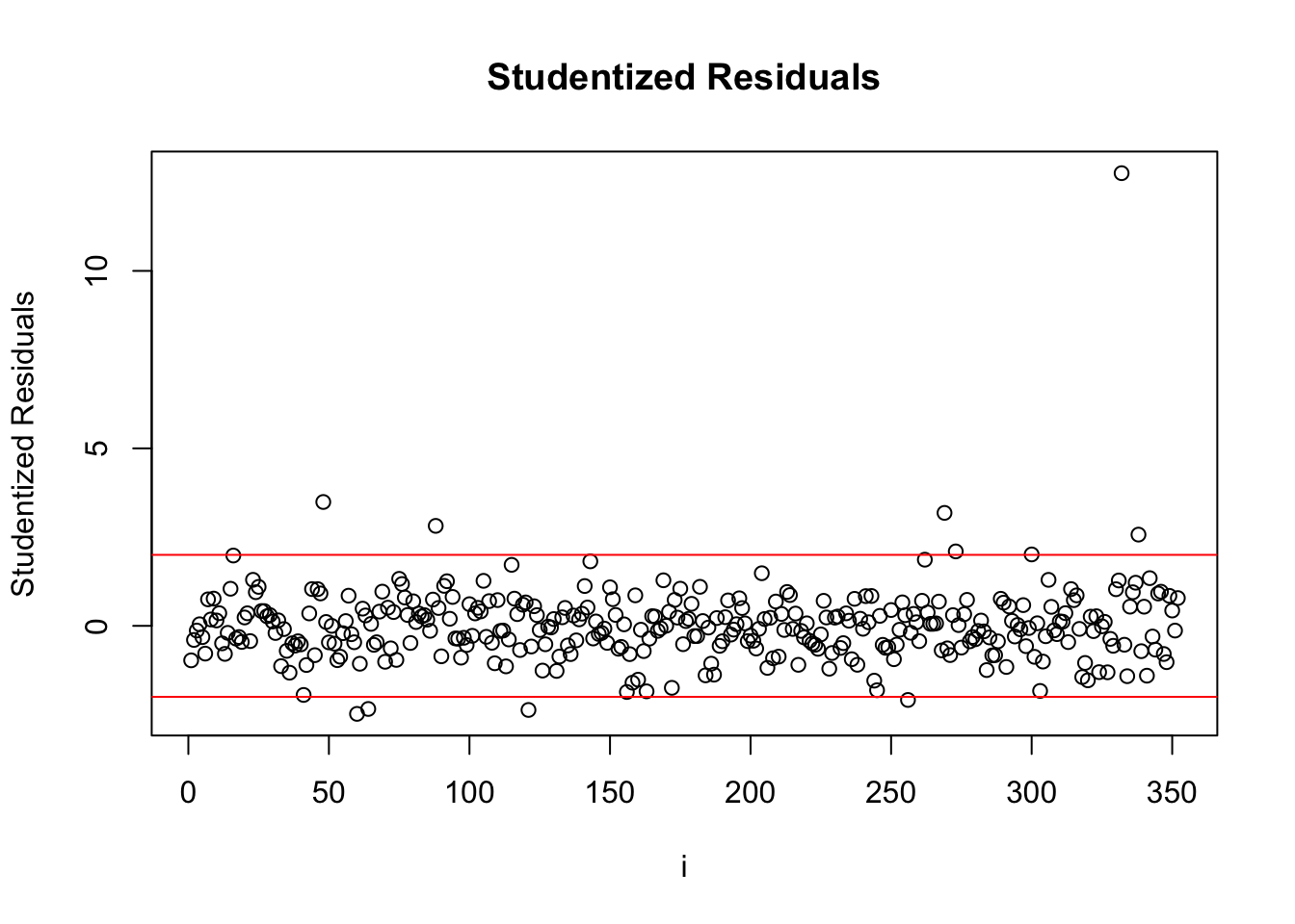
Studentized Residuals
| county | state | Student Residuals |
|---|---|---|
| Kings | NY | 12.753 |
| Atlantic | NJ | 3.490 |
| St._Louis_City | MO | 3.183 |
| Ector | TX | 2.817 |
| Leon | FL | 2.570 |
| Delaware | IN | 2.480 |
| Jefferson | KY | 2.369 |
| Madison | AL | 2.341 |
| Pulaski | AR | 2.097 |
| Columbiana | OH | 2.088 |
| Shawnee | KS | 2.012 |
| Clay | MO | 1.981 |
We can see from the Studentized residuals that there are a few notable points. Kings county in NY is extremely far away from other points. We compared models with and without Kings county but we found that keeping Kings county in the data set had a better test mean squared error.
DFBETA on continuous coefficients
| county | coefficient | DFBETA |
|---|---|---|
| Kings (NY) | log(percapitaincome) | -5.579 |
| Kings (NY) | log(pop1834) | -5.005 |
| Atlantic (NJ) | log(percapitaincome) | 3.532 |
| Kings (NY) | log(poors) | 3.401 |
| Kings (NY) | log(percapitaarea) | -2.924 |
| Leon (FL) | log(pop1834) | 2.610 |
| Kings (NY) | log(percapitabeds) | -2.463 |
| Fulton (GA) | log(percapitaincome) | 2.322 |
| Ector (TX) | log(percapitaincome) | 1.700 |
| Westchester (NY) | log(percapitaincome) | -1.634 |
| Pitt (NC) | log(pop1834) | -1.578 |
| Clay (MO) | log(percapitaincome) | -1.499 |
| Columbiana (OH) | log(percapitaincome) | 1.410 |
| Delaware (IN) | log(pop1834) | -1.399 |
| Manatee (FL) | log(pop1834) | -1.234 |
| Pitt (NC) | log(percapitaincome) | -1.222 |
| Sarasota (FL) | log(pop1834) | -1.208 |
| Philadelphia (PA) | log(percapitaincome) | 1.169 |
| Columbiana (OH) | log(pop1834) | 1.144 |
| Alachua (FL) | log(pop1834) | 1.045 |
| Atlantic (NJ) | log(poors) | 1.033 |
| Davis (UT) | log(percapitaincome) | 1.002 |
| Collier (FL) | log(percapitaincome) | 0.994 |
| Yolo (CA) | log(percapitaincome) | 0.990 |
| Hampshire (MA) | log(pop1834) | -0.990 |
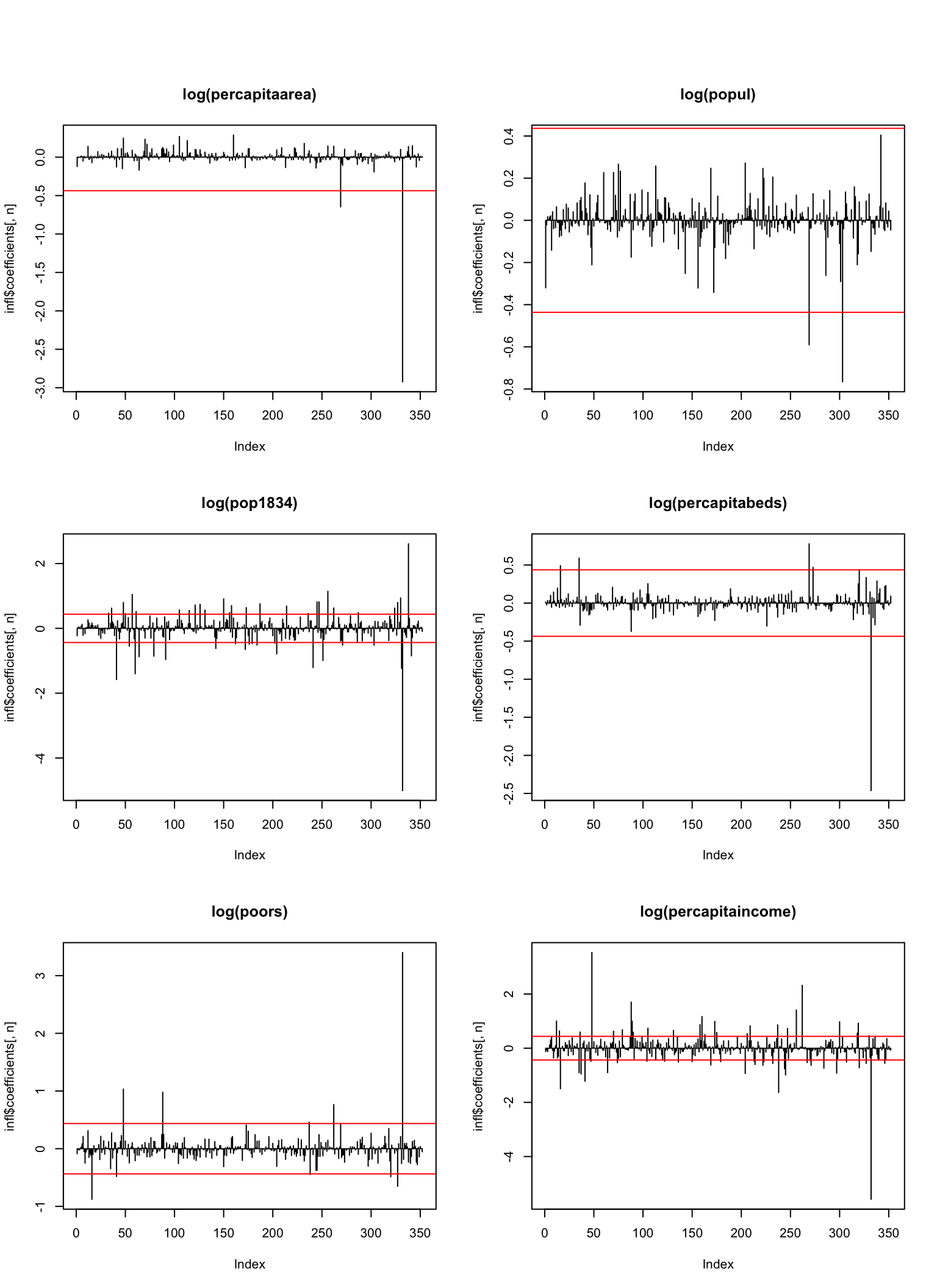
This table shows the sorted extreme \(DFBETA\) values for each of the coefficients. Take for example Monroe (IN), which has a huge influence on the \(pop1834\) parameter. If we look at the data, we see that Monroe has 26.1, 29% of its population between 18 and 34. We see that Kings (NY), influences many of the coefficients and has some of the most extreme values. It is by far the most influential and extreme point in the data.
Model Diagnostic Plots
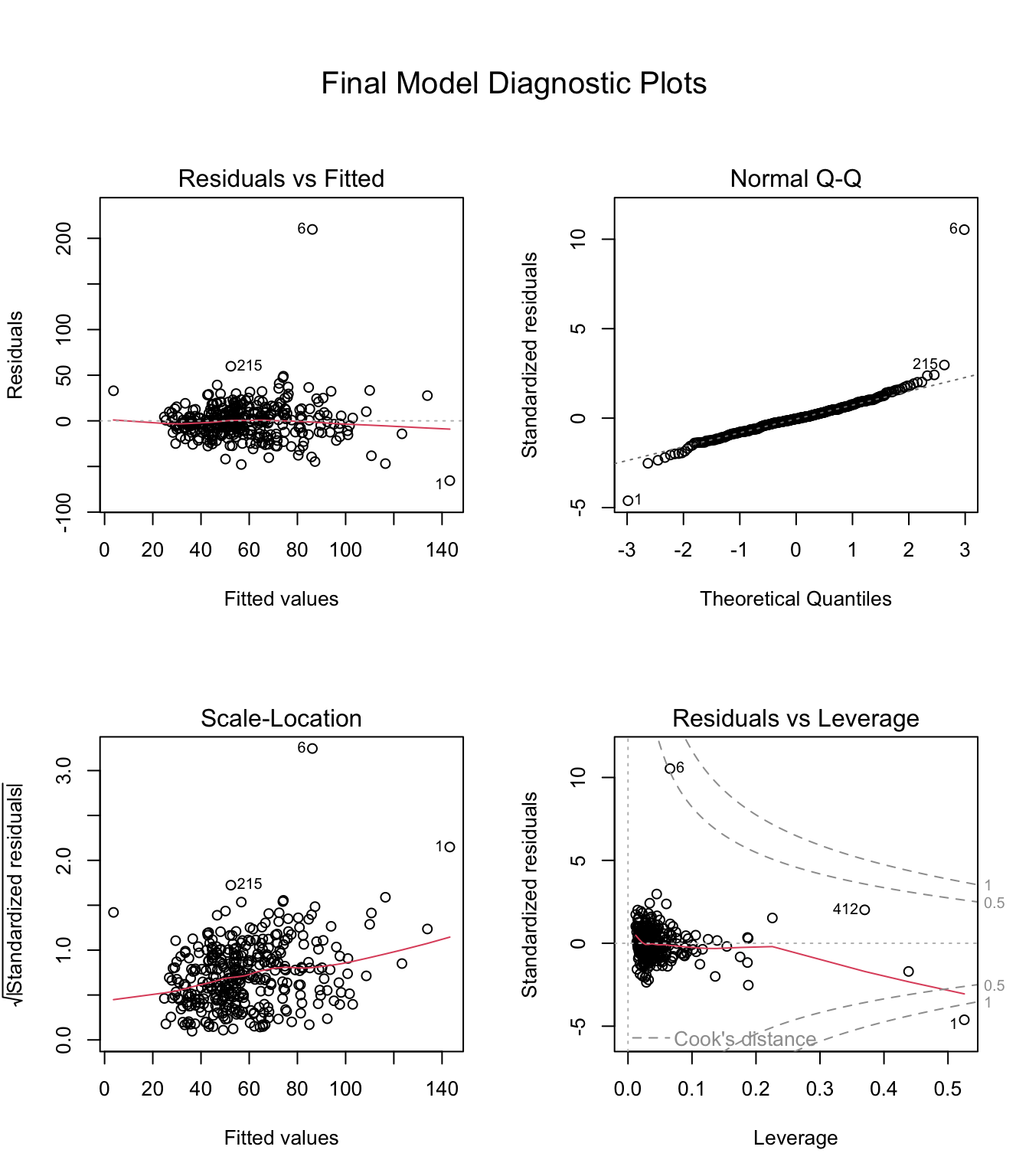
We can see from the diagnostic plots that the residuals and fitted values are approximately symmetric and the residuals don’t appear to be increasing or decreasing as the fitted values increases. The normal QQ plot shows that we have larger tails than we would like. The estimates for the parameters do not dependent on it following a normal distribution but our p-values should be interpreted a little pessimistically. The two points that are labeled, 6 (Kings) and 1 (Los Angeles) are outliers. We can see that Los Angeles has a high leverage and also an extreme standardized residual which makes it influential. Kings county is closer to the mean for the dependent variables so it’s leverage is lower. It is still marked by the Residuals vs Leverage plot as an issue as its residual is so high.
Correlations
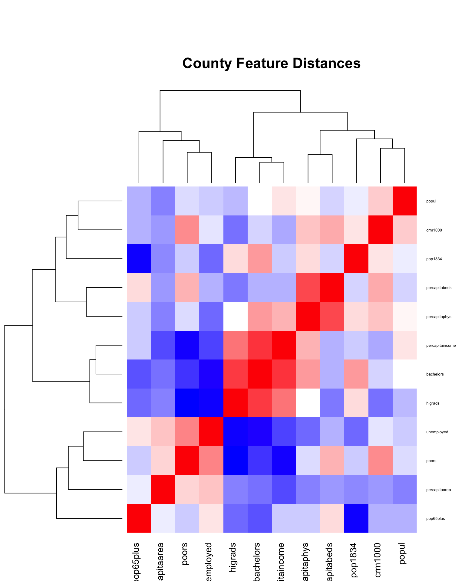
This clustered distance matrix was how we selected which variables to remove from the model. The blue variables are negatively correlated with each other and the red variables are positively correlated.
Outliers
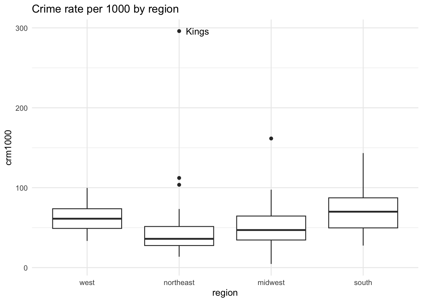
We can see that Kings county is high for its region and overall.
References
[1]
Agresti, A. 1990. Categorical data analysis. Wiley.
[2]
James, G. et al. 2014. An introduction to statistical learning: With applications in r. Springer Publishing Company, Incorporated.
[3]
Statistics for applications: 18.650 / 18.6501: 2016. https://ocw.mit.edu/courses/mathematics/18-650-statistics-for-applications-fall-2016.
[4]
Wikipedia contributors 2019. Variance inflation factor — Wikipedia, the free encyclopedia. https://en.wikipedia.org/w/index.php?title=Variance_inflation_factor&oldid=878147754.